
Challenge
Upwork’s transaction history (TH) experience for marketplace clients (CL) and freelancers (FL) had long been cited as confusing and opaque. Users complained about multiple rows for a single contract, cryptic reference IDs, and an overwhelming amount of information that didn’t tie back to their goals. Customer service teams received hundreds of thousands of tickets from people struggling to navigate their transactions. As the product design lead, I partnered with product management, engineering, UX research (UXR), and the broader payments team to re‑imagine and significantly improve the experience.
Overview / Problem
Customers consistently told us that Transaction History did not fit their needs. In the years prior to redesign, more than 20,000 customer‑service tickets were logged about TH and invoicing issues. Two common questions summed up the frustration: “How can I understand the transactions I’ve made?” and “How can I better understand my spending or earnings?”
Internal research and customer feedback revealed several pain points in the existing TH experience:
Users saw multiple transaction rows and invoices for a single contract or milestone, making it hard to know what they had paid for. Totals and line items were not grouped together and users couldn’t tell how amounts were connected, especially when fees, taxes and refunds were all listed separately. Many clients wanted to know how much they had spent or earned in a given time period and on which projects, and expected the page to show a total based on filters.
These issues resulted in users piecing together information across transaction history, invoices, and CSV exports. The redesign aimed to address these unmet needs by providing clear totals, meaningful filters and contextual information while reducing cognitive overload.
Driving Strategic Implementation
I drove the strategic direction by partnering closely with product and engineering leadership to align on the best path forward. Through design explorations, technical reviews, and prioritization discussions, I helped frame the trade-offs between user needs and system complexity, ultimately guiding the team toward solutions that simplified the experience without sacrificing flexibility. This collaborative approach ensured the design vision was both ambitious and achievable, resulting in changes that redefined how users navigate, interpret, and trust their financial records.
The redesign delivered measurable improvements across both clients and freelancers:
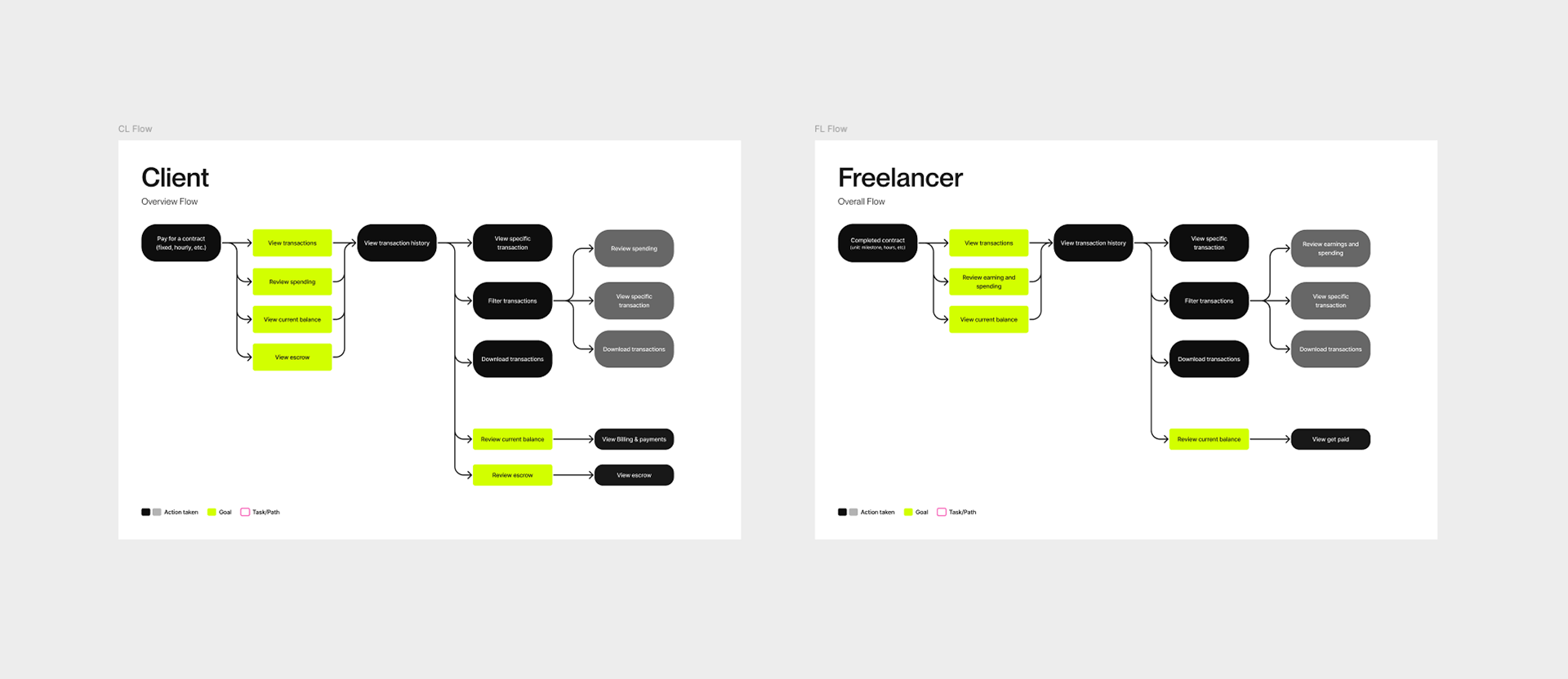
Client Ease of Use
Scores increased from 49.1 to 73.1 (▲24.0 points, ~48.9 % improvement).
Scores increased from 49.1 to 73.1 (▲24.0 points, ~48.9 % improvement).
Client CSAT
Scores increased from 52.4 to 78 (▲25.6 points, ~48.9 % improvement).
Scores increased from 52.4 to 78 (▲25.6 points, ~48.9 % improvement).
Freelancer Ease of Use
Scores increased from 84.4 to 91.3 (▲6.9 points, ~8.2 % improvement).
Scores increased from 84.4 to 91.3 (▲6.9 points, ~8.2 % improvement).
Freelancer CSAT
Scores increased from 85.3 to 92.4 (▲7.1 points, ~8.3 % improvement).
Scores increased from 85.3 to 92.4 (▲7.1 points, ~8.3 % improvement).
These results exceed the initial goal of raising TH CSAT from 5.91/7 to 6.18/7 and demonstrate that simplifying the experience materially improved customer satisfaction. Engineering teams also reported faster page loads due to consolidated API calls.
Principles
I collaborated with stakeholders to articulate a set of design principles that would steer solution exploration:
Reduce cognitive load
Display only the information needed to accomplish a task and hide details unless explicitly requested. Simplify negative values by using minus signs instead of parentheses and by using positive/negative color coding in a subtle way.
Display only the information needed to accomplish a task and hide details unless explicitly requested. Simplify negative values by using minus signs instead of parentheses and by using positive/negative color coding in a subtle way.
Collate related information
Group transaction details into cohesive units so clients see a single row per milestone or invoice.
Group transaction details into cohesive units so clients see a single row per milestone or invoice.
Separate escrow flows
Since most users did not care about escrow, move escrow transactions to their own tab and removed extraneous steps from the main view.
Since most users did not care about escrow, move escrow transactions to their own tab and removed extraneous steps from the main view.
Support the core audience first
Prioritize marketplace clients and freelancers; plan to extend to agencies and enterprise clients in later waves.
Prioritize marketplace clients and freelancers; plan to extend to agencies and enterprise clients in later waves.
Design for flexibility and scalability
Build patterns that can support wallet features, value‑added services, and future payment products.
Build patterns that can support wallet features, value‑added services, and future payment products.
Make it internationally friendly
Use month names instead of numeric dates, UTC time stamps and invoice formats that meet common international requirements.
Use month names instead of numeric dates, UTC time stamps and invoice formats that meet common international requirements.
Research & Discovery
Qualitative insights
Working with UXR, we synthesized several years of support tickets, customer feedback, and stakeholder interviews. We conducted contextual inquiries with clients and freelancers to understand how they used TH to manage projects, reconcile invoices, and prepare taxes. Clients reported spending hours piecing together multiple transaction lines and receipts. Freelancers noted that the page felt designed for accountants rather than their needs. We also benchmarked other freelance‑economy platforms and banking apps to understand best practices.
Quantitative analysis
Analytics revealed that only a minority of users scrolled past the first few rows of TH; filtering capabilities were limited and difficult and CSV exports were heavily relied on to make sense of finances. We worked with analytics to quantify the number of transactions per invoice and the proportion of support cases linked to TH confusion.
Solution(s)
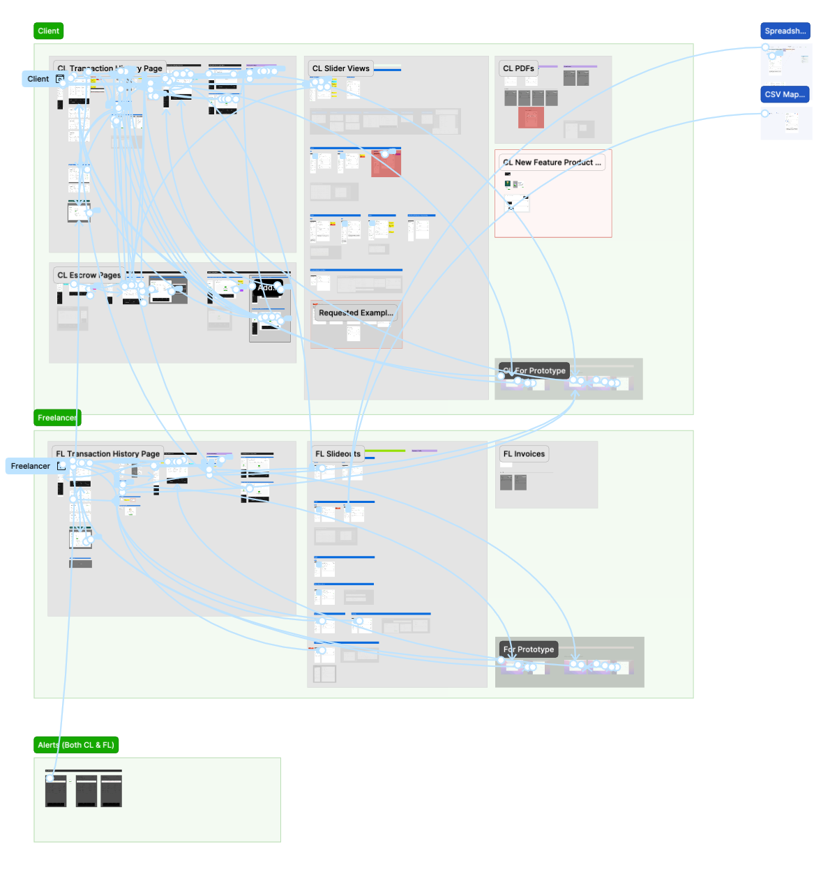
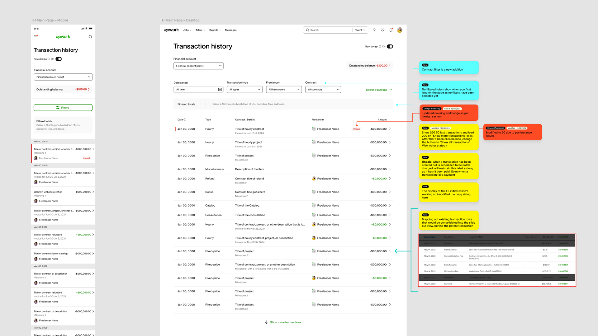
We simplified how information is presented by consolidating milestones and invoices into single parent rows with expandable details, and by rolling fees and taxes into that view. Reference IDs were removed from the primary view, reducing clutter, while still remaining available in downloadable summaries.
Key improvements included:
• Added contract/project filters to let users isolate spending or earnings for specific jobs
• Introduced top-level totals and summaries that adapt to filters
• Streamlined invoices with a unified summary page
• Moved escrow transactions into a dedicated tab, including links only when escrow was used, reducing clutter and isolating complexity
These changes not only simplified day-to-day use but also laid the foundation for ongoing improvements.
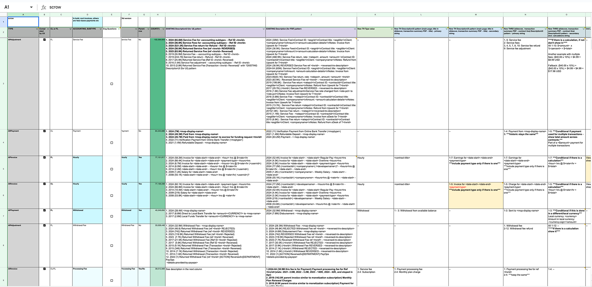
Remapping Transaction Verbiage & Types
To bring clarity to a highly complex system, I mapped hundreds of backend financial transaction types to user-facing language and content that was easier to understand and navigate. This work involved creating a comprehensive spreadsheet of transaction categories and rationalizing how they should surface in the product. In collaboration with engineering, we restructured the information architecture of Transaction History to ensure related items were grouped intuitively, terminology was consistent, and users could quickly orient themselves—laying the foundation for a more transparent and navigable experience.
Simplifying Financial Transparency
In the end, this redesign was about more than tidying up a page – it was about restoring confidence in Upwork’s financial experience. By listening deeply to our users, collaborating across disciplines, and delivering in focused waves, we transformed a source of frustration into a tool that now empowers clients and freelancers alike. The measurable gains in ease of use and satisfaction confirm that clarity and simplicity drive loyalty. As we look ahead to supporting larger segments and new financial products, this project stands as a reminder that thoughtful design, grounded in empathy and data, can unlock meaningful change.